Website Popup
The Website Popup is a lightweight, self-embedding floating widget for any website. Add one script and it appears as an overlay, with a launcher in the bottom-right corner (by default). It is built with React and Tailwind; CSS is injected automatically by the bundle.
Features:
- Self-embedding — loads and initializes when the script runs.
- Floating design — corner launcher + modal; not an inline block.
- Customizable — copy and styles via
window.popupConfig. - Companion integration — the same signup flow can also be used as an Embedded Form (iframe only), without the floating button (registration there always uses
EmbeddedForm; see that page).
It allows visitors to sign up for a daily email summary of "Coming Soon" listings that your team has access to. Once they are signed up, they will have a call to action to join you as a client.
This feature is available exclusively for premium users and can be fully customized to match your website's design. Anyone who signs up through the pop-up will receive a daily email summary of "Coming Soon" listings that your team has access to.
| Floating widget (this page) | Embedded form (iframe) | |
|---|---|---|
| Mechanism | Single <script> on your page | <iframe src="…firstlist-form-embed.html?…"> |
| UX | Corner button + popup modal | Only the form (no launcher) |
| Best for | Full-site promos | CMS embeds, narrow columns, no third-party scripts |
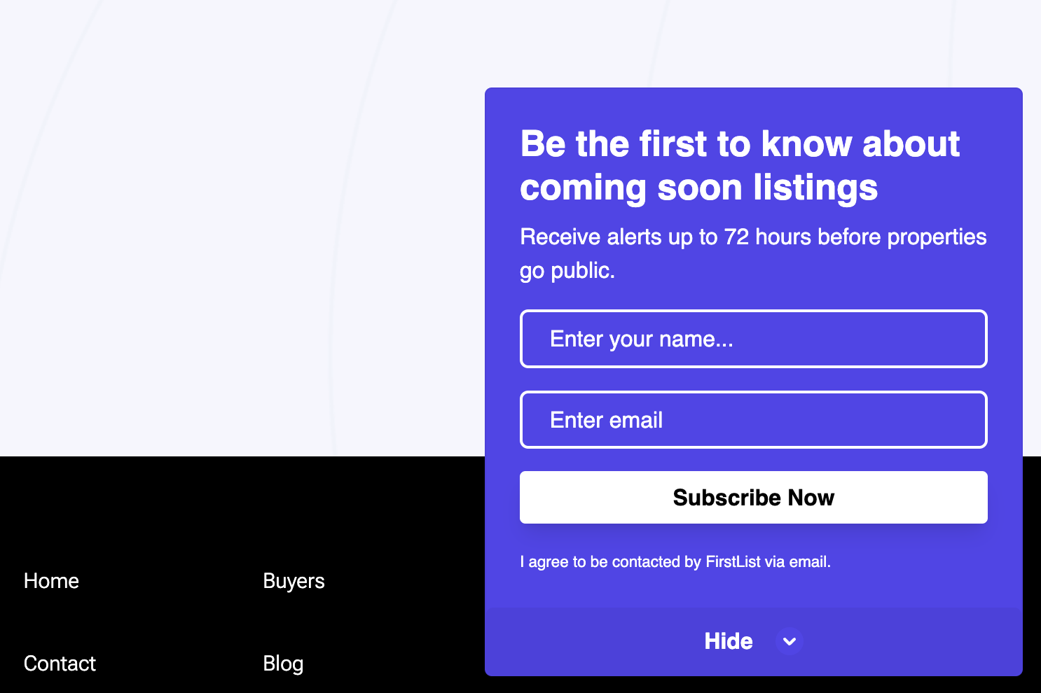
You can view a working example of the FirstList Website Popup on our example page.
To open a larger version, click here.
Floating widget (script tag)
Include the script in your HTML after window.popupConfig:
<script src="https://cdn.firstlist.co/firstlist-widget.iife.js"></script>
Demo / staging build:
<script src="https://cdn.firstlist.co/firstlist-widget-demo.iife.js"></script>
Configure with window.popupConfig before the script. You must set signupType to WidgetComingSoon or WidgetAssignment for the floating widget. That is separate from the iframe embed, which always sends EmbeddedForm to the registration API regardless of URL or popupConfig.
The widget initializes automatically when the script loads.
Default copy
When titleText and buttonText are omitted or set to "":
- Modal headline: Get listings 72 hours before they go public
- Submit button: Subscribe Now
- Floating launcher uses
initialCTAText, or Get Early Access when that is unset or empty.
Add the Popup to Your Website
-
Login
to your FirstList account. - Navigate to the Settings page.
- Ensure you are subscribed to the Premium plan.
- Find the Website Popup tab.
- Copy the embed code.
- Paste the embed code into the HTML of your website.
- Configure the popup using the Basic Configuration section below (include
signupType).
How It Works
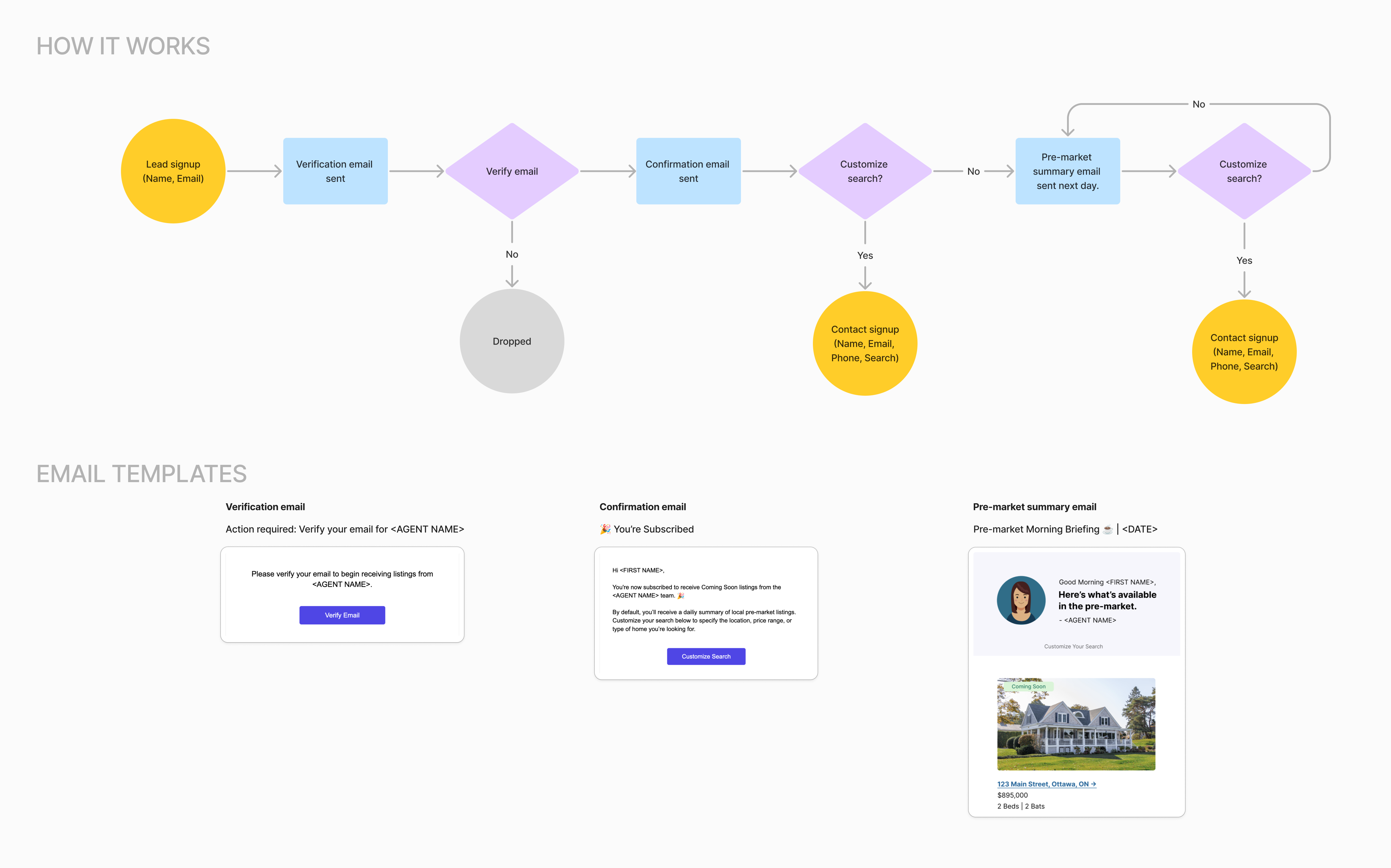
- Visitors sign up by providing their name and email.
- They receive an email to verify their email address.
- After verification, they receive a confirmation email with details about their subscription to your team's daily "Coming Soon" email, along with an option to complete their signup and create a property search.
- They begin receiving daily listing summaries, featuring "Coming Soon" properties your team has access to. Each email includes a call to action to reach out to you or adjust their search criteria.
- All new signups are automatically added as contacts in your FirstList account.
Basic Configuration
window.popupConfig = {
  apiKey: '28de96c0-c6bc-42ff-8a97-4c880933337c', // Required – your public API key
  signupType: 'WidgetComingSoon', // Required – "WidgetComingSoon" or "WidgetAssignment" (not used for iframe Embedded Form)
  position: 'right', // Optional – "left" or "right"
  timeDelay: 2, // Optional – delay (seconds) before the widget appears
  titleText: '', // Optional – modal title (see defaults above if empty)
  footerText: '', // Optional – footer note
  initialCTAText: 'Get Early Access', // Optional – floating launcher CTA
  buttonText: '', // Optional – submit button (see defaults above if empty)
  googleFont: 'Helvetica Neue', // Optional – Google Font or system font

  styles: {
    // Optional – visual customization
    roundedSize: 15,
    backgroundColor: '#ffffff',
    fontColor: '#000000',
    footerColor: '#808080',
    buttonBackgroundColor: '#000000',
    initialBackgroundColor: '#ffffff',
    errorColor: '#df0000',
    buttonHoverColor: '#1b1b1b',
    buttonTextColor: '#ffffff',
    borderColor: '#D1D5DB',
    paddingSides: '10px',
    paddingBottom: '24px',
  },
}
Core Options
| Option | Type | Default | Description |
|---|---|---|---|
apiKey | String | Required | Your unique API key for the popup |
signupType | String | Required | WidgetComingSoon or WidgetAssignment (floating widget only; iframe embed uses EmbeddedForm separately) |
position | String | "right" | Widget position ("left" or "right") |
timeDelay | Number | 2 | Delay in seconds before widget appears |
titleText | String | "" → default headline (see above) | Modal title |
footerText | String | "I agree to be contacted by <team name> via email." | Footer text |
initialCTAText | String | "Get Early Access" | Floating launcher button |
buttonText | String | "" → Subscribe Now | Submit button in the modal |
googleFont | String | "Poppins" | Google Font for the widget |
Style Options
| Option | Type | Default | Description |
|---|---|---|---|
roundedSize | Number | 5 | Border radius in pixels |
backgroundColor | String | "#ffffff" | Background color of the widget |
initialBackgroundColor | String | "#ffffff" | Background before user interaction |
fontColor | String | "#1d1d1d" | Main text color |
footerColor | String | "#808080" | Footer text color |
buttonBackgroundColor | String | "#1d1d1d" | Button background |
buttonHoverColor | String | "#000000" | Button hover background |
buttonTextColor | String | "#ffffff" | Button text color |
errorColor | String | "#df0000" | Error / validation color |
borderColor | String | "#E4E4E4" | Input borders |
paddingSides | String | "10px" | Horizontal spacing from screen edges |
paddingBottom | String | "24px" | Distance from the bottom of the screen |
Implementation Example
<!DOCTYPE html>
<html>
  <head>
    <title>My Website</title>
  </head>
  <body>
    <script>
      window.popupConfig = {
        apiKey: 'your-api-key-here',
        signupType: 'WidgetComingSoon',
        position: 'right',
        timeDelay: 2,
        titleText: 'Access listings 72 hours before they go public',
        initialCTAText: 'Get Early Access',
        buttonText: 'Sign Up',
        footerText: 'I agree to be contacted by <team name> via email.',
        googleFont: 'Poppins',
        styles: {
          roundedSize: 5,
          backgroundColor: '#ffffff',
          initialBackgroundColor: '#ffffff',
          fontColor: '#1d1d1d',
          footerColor: '#808080',
          buttonBackgroundColor: '#1d1d1d',
          buttonHoverColor: '#000000',
          buttonTextColor: '#ffffff',
          errorColor: '#df0000',
          borderColor: '#E4E4E4',
          paddingSides: '10px',
          paddingBottom: '24px',
        },
      }
    </script>
    <script src="https://cdn.firstlist.co/firstlist-widget.iife.js"></script>
  </body>
</html>
Notes
- All style colors should be provided in hexadecimal format.
apiKeyandsignupType(WidgetComingSoonorWidgetAssignment) are required for the floating widget.- Place the widget script after
window.popupConfig. - The Google Font specified must be available in the Google Fonts library.
- Replace
<team name>in thefooterTextwith your actual team name. - For iframe-only embedding (no floating UI), use the Embedded Form page—
signupTypein the URL there does not control registration; the API always receivesEmbeddedForm.